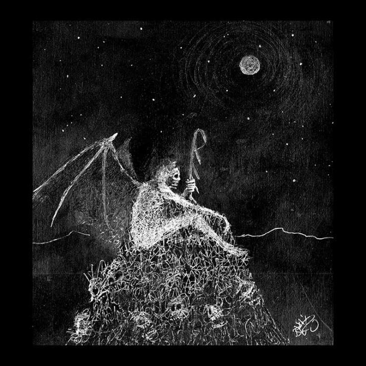
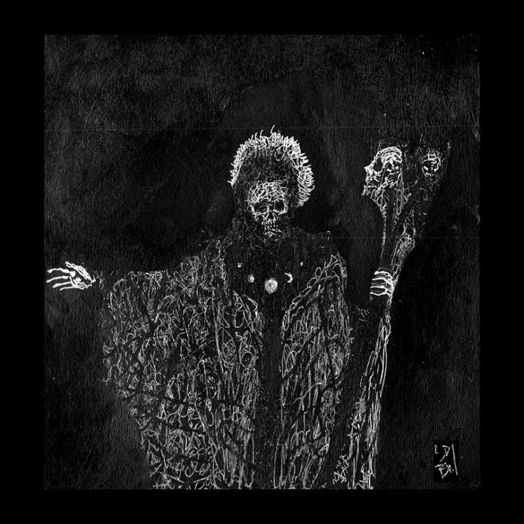
I don’t think my work is in anyway unique. If you understand the ingredients that go into a “Datura” then you should be able to make one for yourself. Now, there are somethings that keep my work moving forward, and those “somethings” are self-determined. I’m talking about ego and editing. I found and find myself annoyed by stagnation in my own work. In the beginning, I was annoyed by making portraits without dynamic poses, I was annoyed by the recurring theme of “small guy faces off against giant”, I got annoyed by my limited color palettes. I’d get annoyed with paintings or drawings that I finished and would paint over them, draw over them, or edit and mash them into new pieces in photoshop.
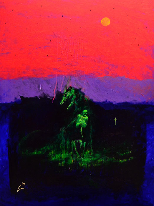
If you were to follow the development of my art through the years, you can see me brute-forcing my way through new palettes. It started with black and white, black and red, blue and black, blue and white, pink and black, purple and pink, etc etc… It took a lot of trial and error to find color schemes and specific shades of paint that work best together.
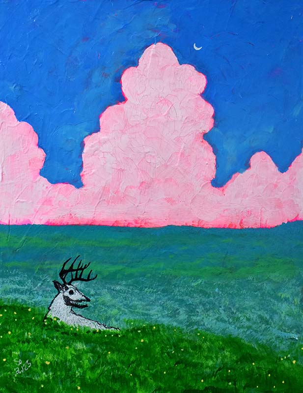
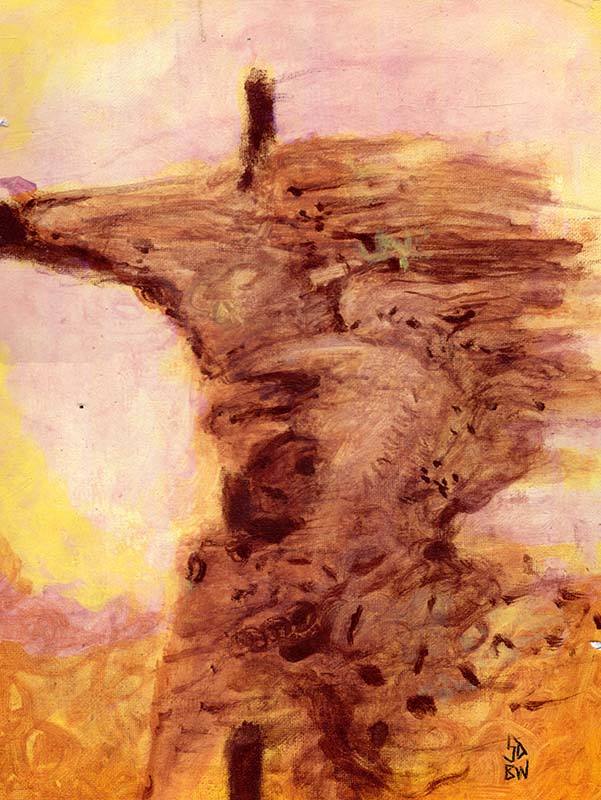
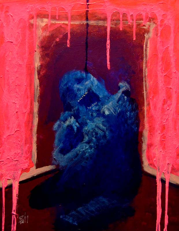
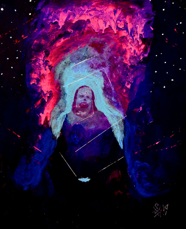
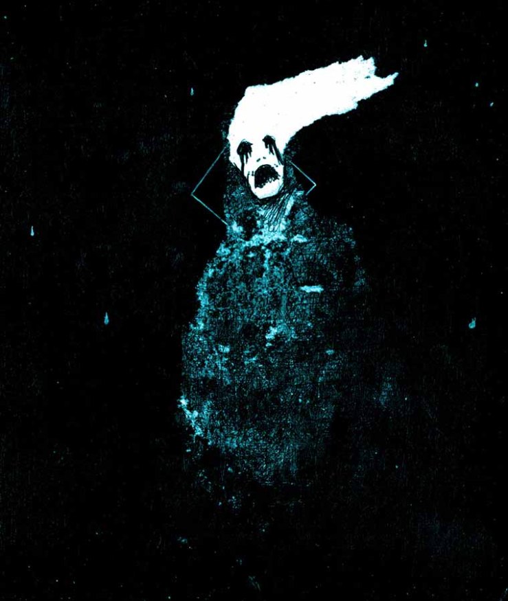
I think my work stands out in color, mostly. And that was always the intention. My work is not anatomically great, my work is not great from a composition standpoint, my work is not great from many angles. What I can do to offset my lack of formal training is use heavily saturated and loud colors.
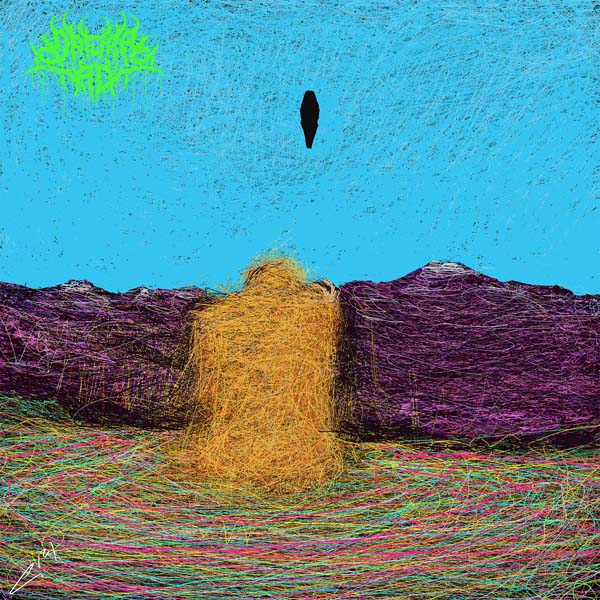
The skulls and faces are relatively simple, the anatomy of my animals aren’t particularly dynamic or real-world accurate, and the good thing about art, is that that can absolutely work just fine.
The idea I keep coming back to is subgenres in distorted-guitar-music. The truly great artists like Bekskenski create work that would sound like symphonic death metal, and my barebones style – I’d say it’s more to older hardcore. Something simple but hard hitting. And that’s always the gray line with dark art. If our stuff is too polished, then it begins to drift into video game monster or fantasy novel territory. If our stuff is too sloppy then we’re no different than the endless waves of no name Basquiat wannabes.
There are a number of contemporary artists that I draw heavy inspiration from, but I’m not too sure if they’d want to be associated with what I do or who I am. I have a good amount of self-hatred going on and that’s just always been the case, so I won’t mention or showcase any of them, but if you’ve followed me on Instagram, you should know which modern artists I resonate with.
Here’s how the basic stew is made, and you can mix them however you want.
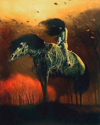
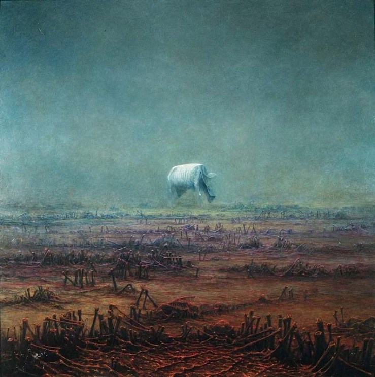
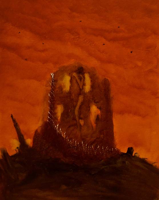
Beksiński – I go back to Zdzislaw constantly. I think every dark artist does. He was the first to do it at this level. His compositions are great; his color schemes were great. For the first two years of painting, I was primarily a finger painter. When I started to use brushes and more varied color schemes, I went to Beksiński. I like to study how he lays out his compositions; I try to see his take on portraits and perspective.
Do I make studies of his work? No. But I think you can easily see his influence in what I do. And you should be able to see his work that I’ve gone back to time and time again. I’d highlight specifically his rotted horse rider piece. I’d say a lot of my landscape work is a bastardized expansion on what Bekskinski did. His landscapes were great, but there weren’t a ton of them, and they weren’t doing what I liked.
He has a few with a singular subject against a desolate landscape, but there’s not many. So my landscape work became that. Make what you want to see.
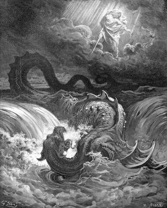
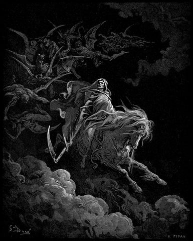
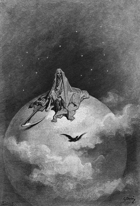
Gustave Dore – Dore is the one artist who managed to make a drawing that, to this day, still makes me feel uneasy. His Destruction of Leviathan carries so much weight, so much impact. I seen this thing twenty, thirty years ago, and it almost felt wrong to look at. The serpent falling into the ocean just hits. It has weight. You can feel the enormity of it all.
Dore was prolific. Our styles are very much different, he was an engraver and an illustrator, neither of which, I am or ever will be. His work, his anatomy, his compositions, they’re just wonderful. His darker stuff, probably because they’re in the public domain, turns up time and time again on album covers. If you want to create an ink-Datura, look at a lot of Dore. I can’t say enough about the guy’s work.
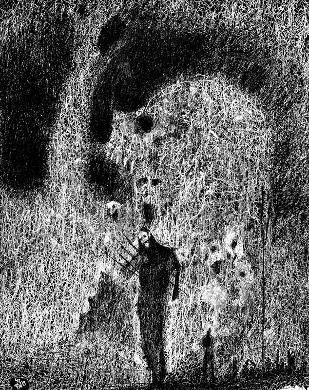
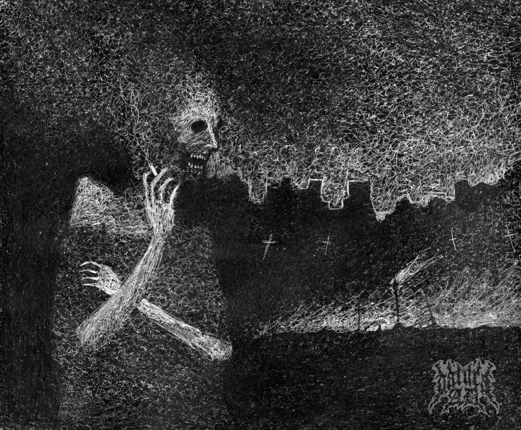
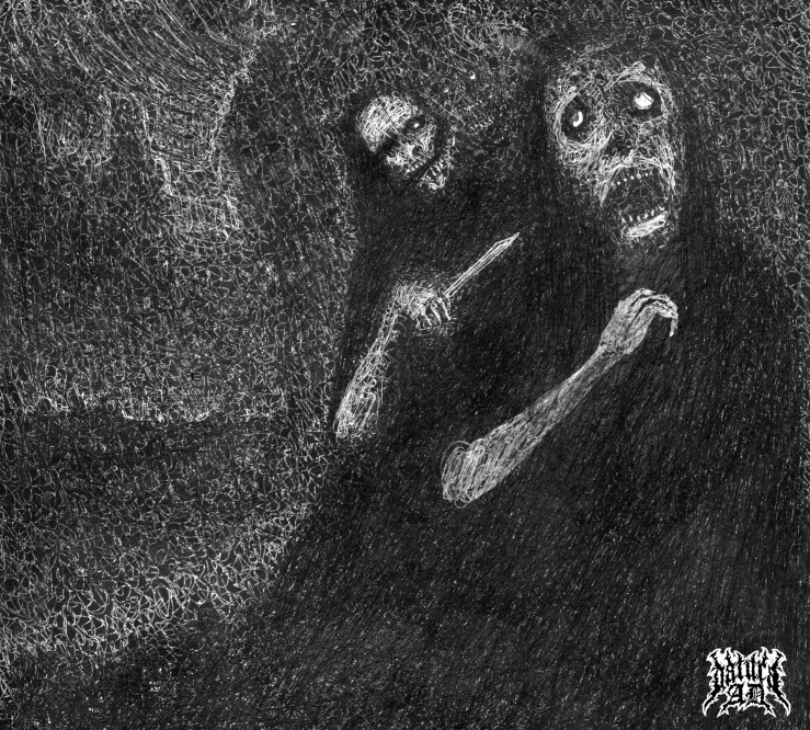
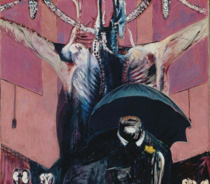
Francis Bacon – Who in our genre, ain’t influenced by Francis Bacon? His work speaks for itself. There are artists in our field that have made entire careers based solely off of Bacon, just like the Basquiat worshippers or the Zdzislaw worshippers. Some do it well, some don’t. I don’t know where I fall on that spectrum, we’ll say in the middle.
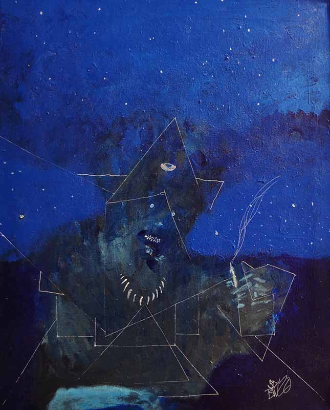
Almost all of my work, my humanoid work at least, features an open mouth with jagged teeth. I don’t know if that’s because I myself am a open mouthed, underbitten savage who wants some representation in his work, if it’s because showing a screaming mouth works as an amazing shortcut for conveying agony and loss.
I find a good bit of Bacon’s taste in color to be… muddy and not particularly great, but the good stuff is the Good Stuff. His sea green and black pope portraits, his violet and neutral blacks, grays, and browns, his reds and grays.
There was a time where I would add these geometric lines into my work, mostly because of how much Francis Bacon I was looking at, but also because some of those geometric lines just felt right. I think in the more… excited art, the more excited paintings, you can, or at least I can, see where things naturally segment themselves off into. It’s very easy to highlight these sections with a ruler and a gel pen.
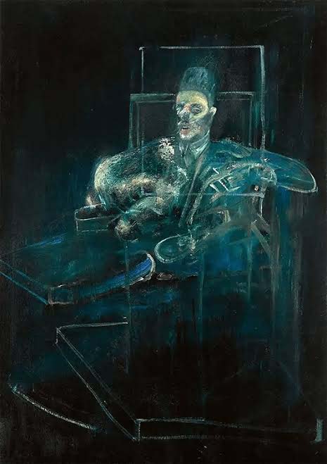
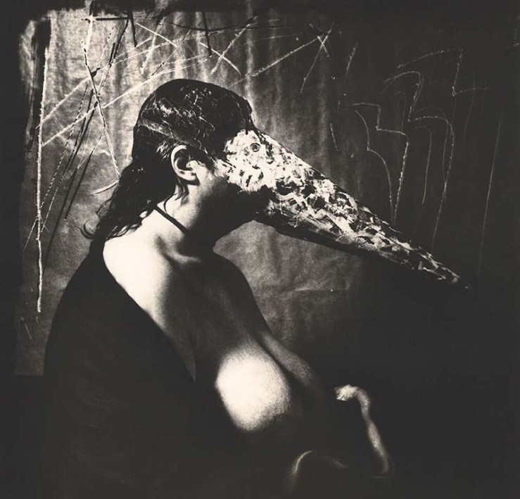
Joel-Peter Witkin – Oddly controversial in art discussions. I guess I’m so desensitized to dark art that the mediums that he used don’t really hit as hard as they do for others. Yeah, he used real corpses for his work, but that’s just edgy shit. Edgy shit has been around forever. I get sanctity and respecting life, but what are we really doing here? The work exists, and the work is metal as fuck.
I think, if we’re going to pretend that there’s not some primal monkey-poking-at-a-rotting-snake level of fascination with his work, we can highlight his use of negative space. It’s wonderful. We don’t need to use the entire canvas to create effective art. Sometimes, a single figure surrounded by a few restrictive colors is all you need to make a good composition.

This entry is intended to be short. So, I’ll wrap up soon. But we’re talking influences, and one big influence on my work, that I wasn’t even aware of, was the work of Travis Smith. Back in my day, the day of print media – Wizard Magazine, Hit Parader, Revolver, etc. etc… – back in rural South Dakota, there wasn’t a lot of easily accessible darker media. We would sit in cars that barely worked, listening to radio static, hoping that the hard rock and metal station, based out of a city damn near three hours away, would break through for a few songs.
We bought albums based solely off of artwork, and we had to travel to even do that. The nearest spot to get music was in Pierre, SD. That’s a solid 70 minutes away.
I used to draw shit-I-found-cool in my magazines. It didn’t matter if I listened to the band or not. If it looked cool, I’d draw it. If it looked really cool, I’d draw it and redraw it.
And, what I found out, some fifteen years later, is that a lot of those album covers and shirt designs that I would redraw in my down time, they were all Travis Smith’s work.
I’m not super interested in graphic design, and I’m not the biggest fan of Travis Smith’s work these days – as in, I don’t follow him anywhere or seek out his stuff, but I can’t say that I wasn’t heavily influenced by him in the early years.
And his work is just straight up iconic. If you go through his client list, you’ll see great albums that you love or loved, and you might not know that it was this fella who did all of ’em.
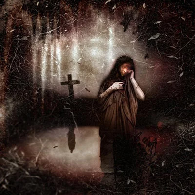

 Behold A Red Horse